The concept
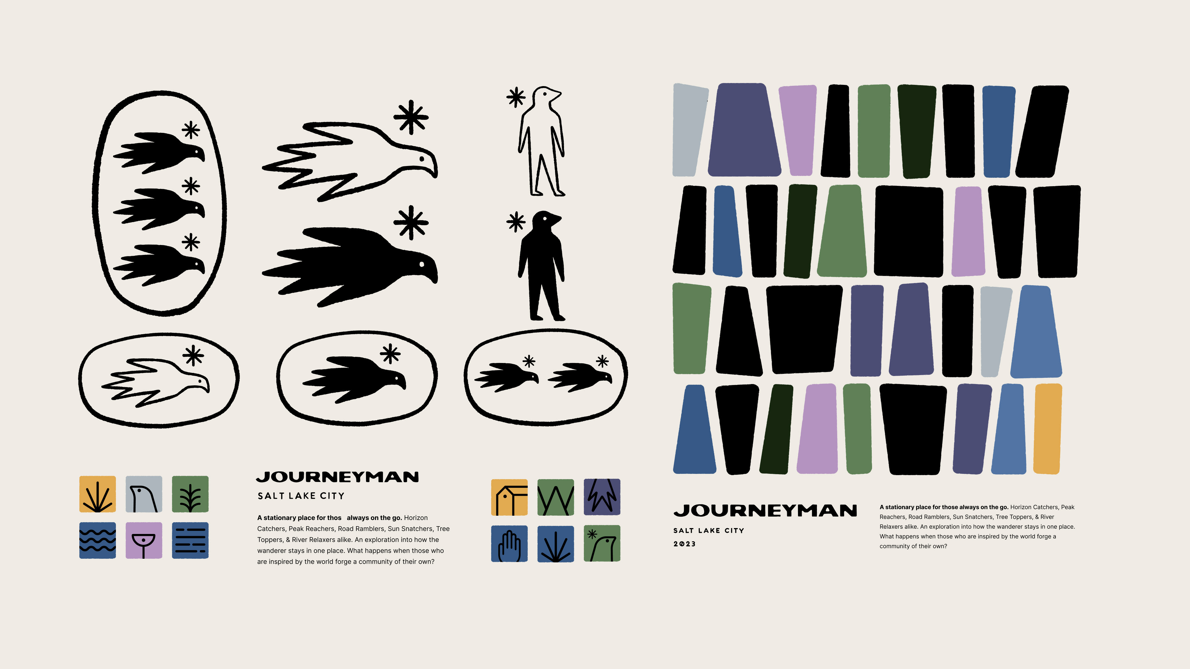
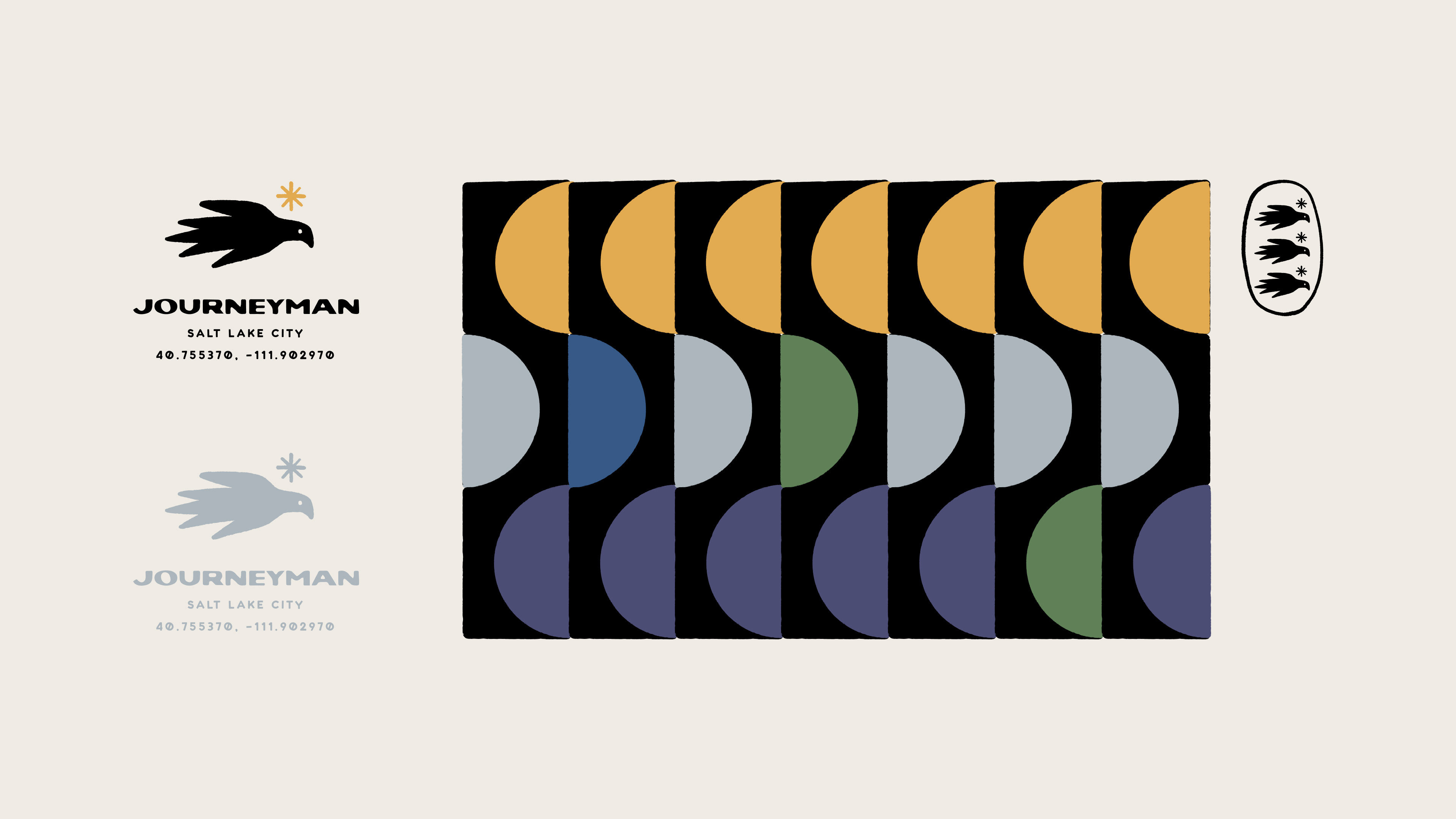
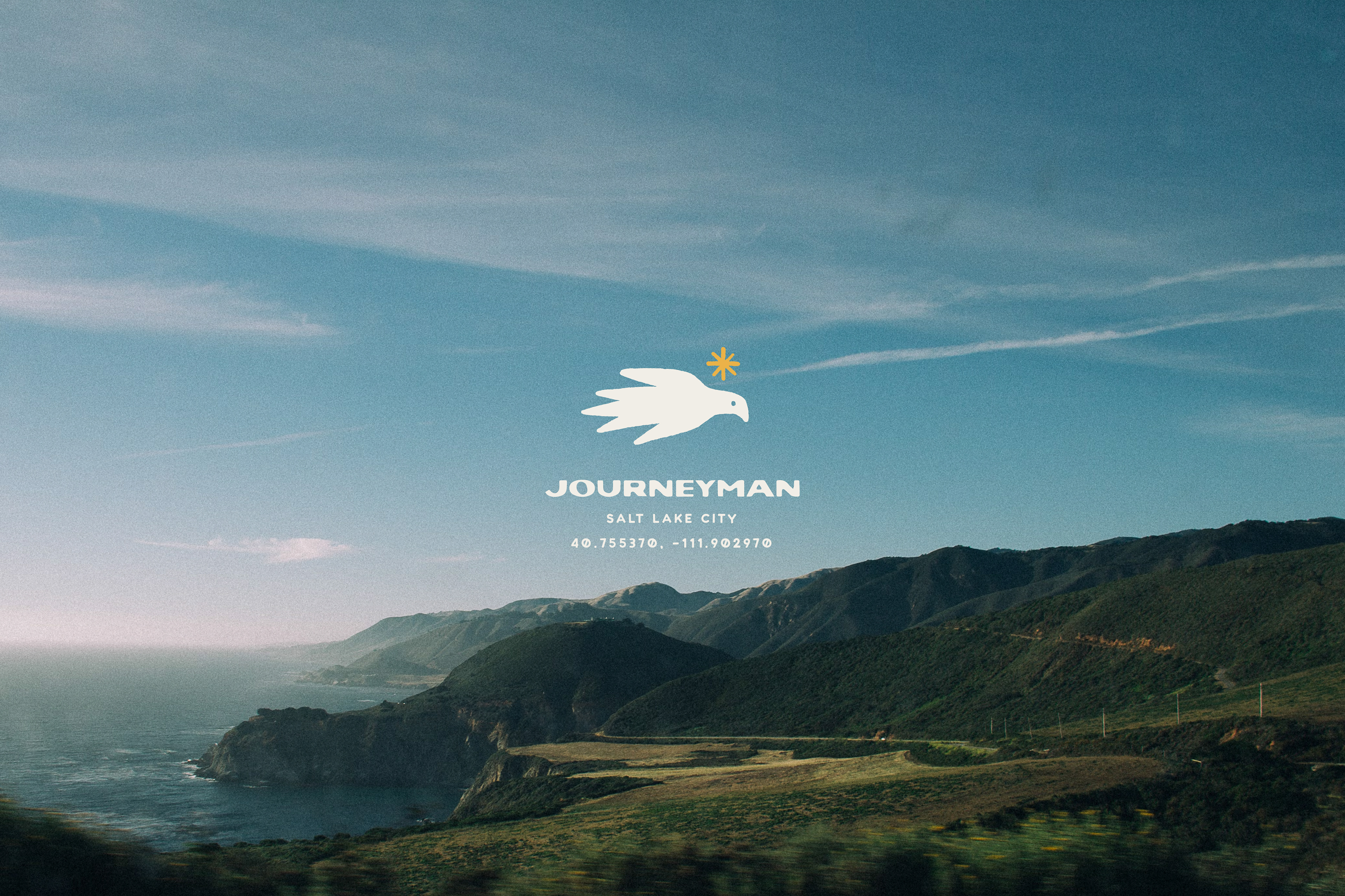
The logo communicates the concept of discovering new places and new experiences to connect with others. The Journeyman, with the sun as a guide, always in search of a new destination. Represented by a Tordo Arrocero.
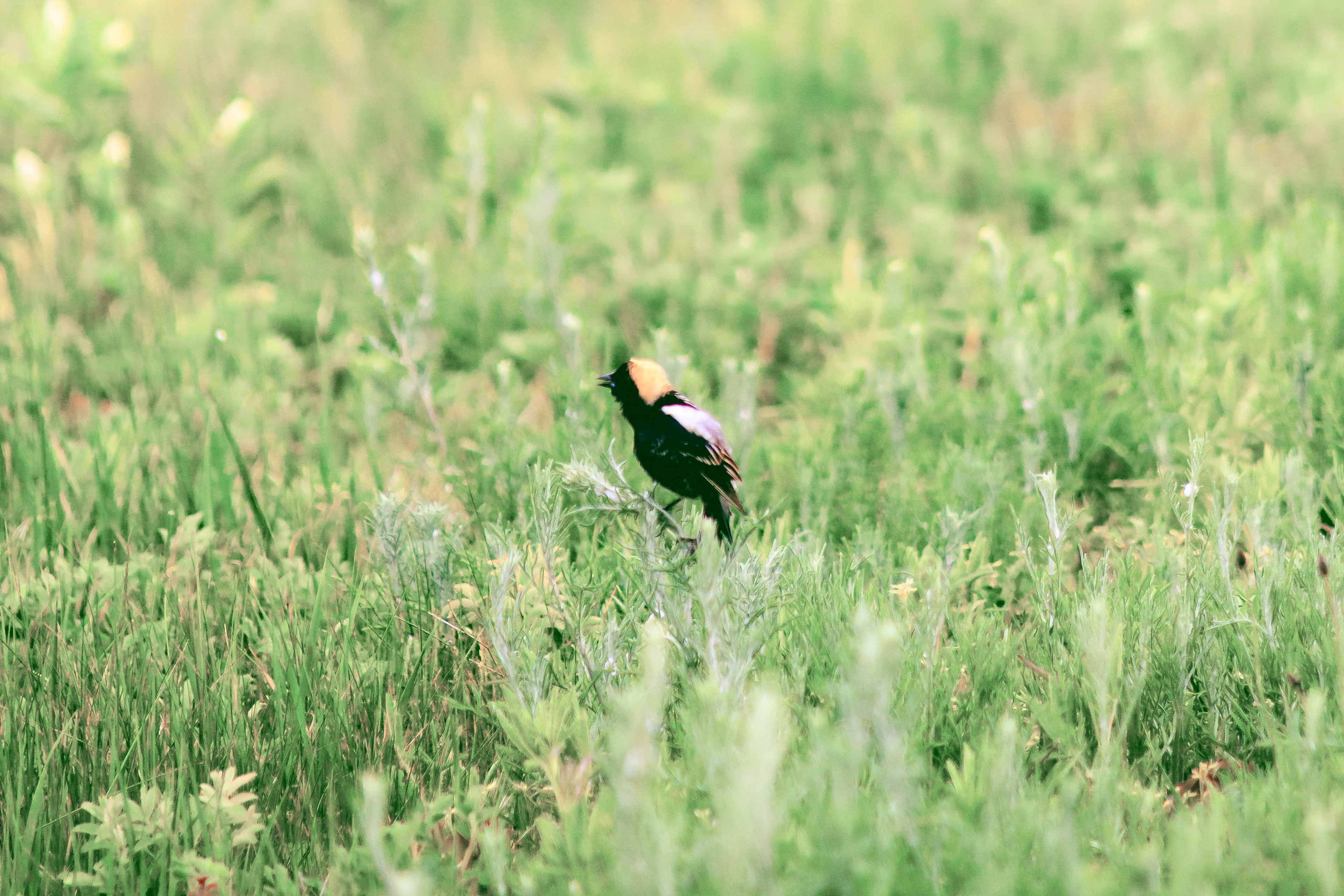
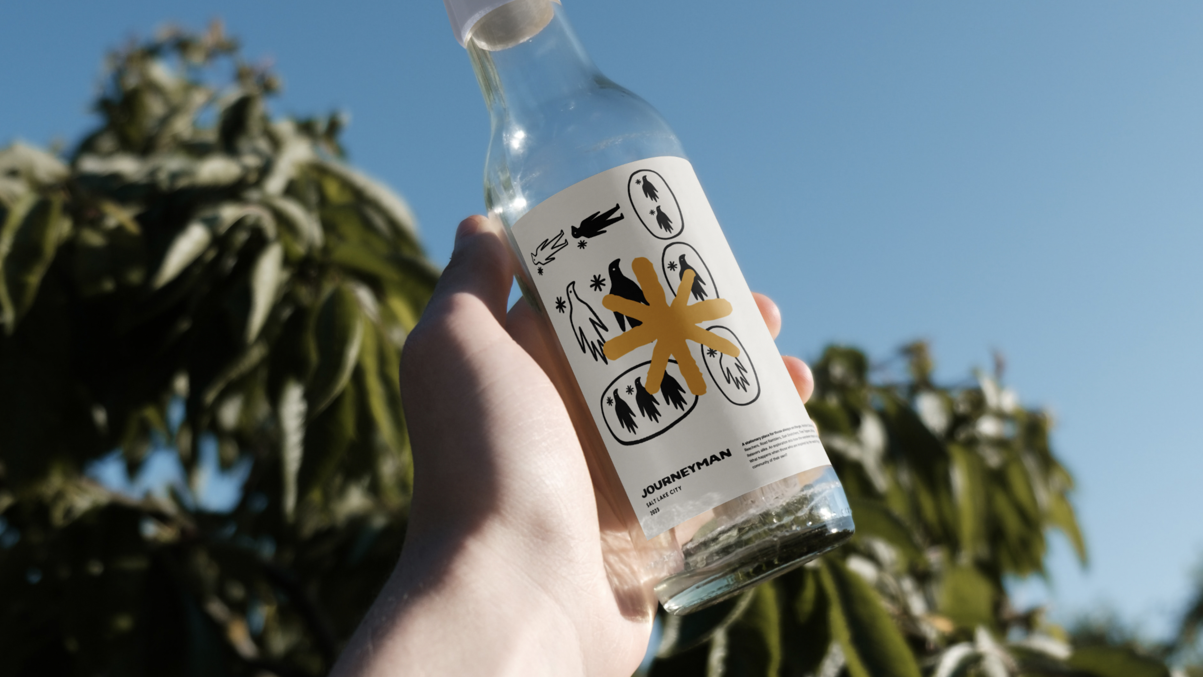
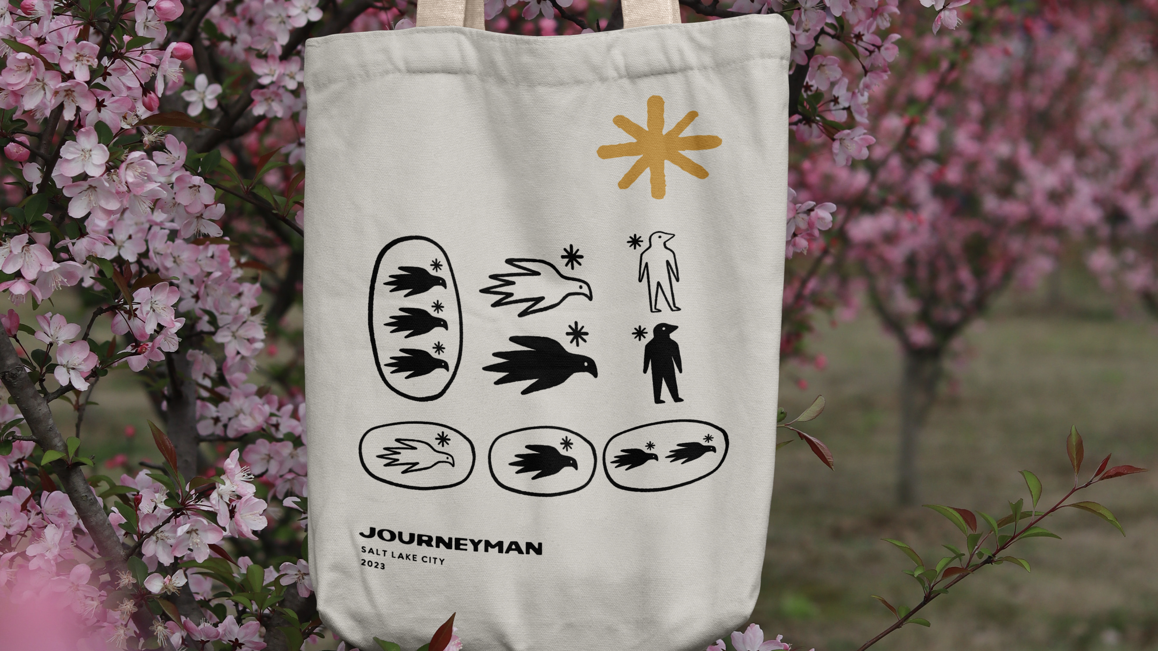
The Tordo Arrocero
Migratory bird that flies annually from temperate North America to South-Central and South America. It is known for having the longest migratory route of all land birds on the American continent.
Migratory bird that flies annually from temperate North America to South-Central and South America. It is known for having the longest migratory route of all land birds on the American continent.
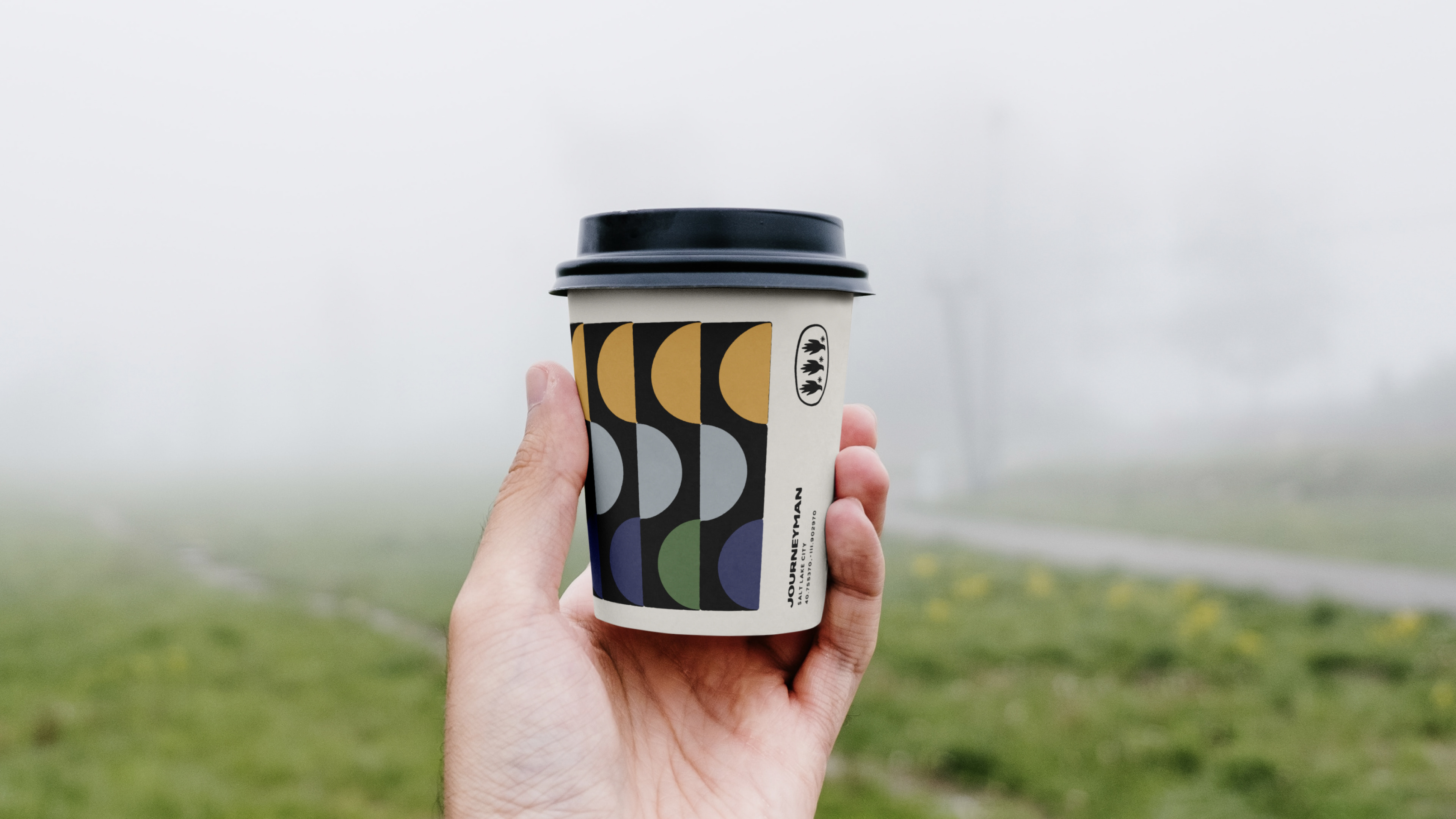
Graphic style
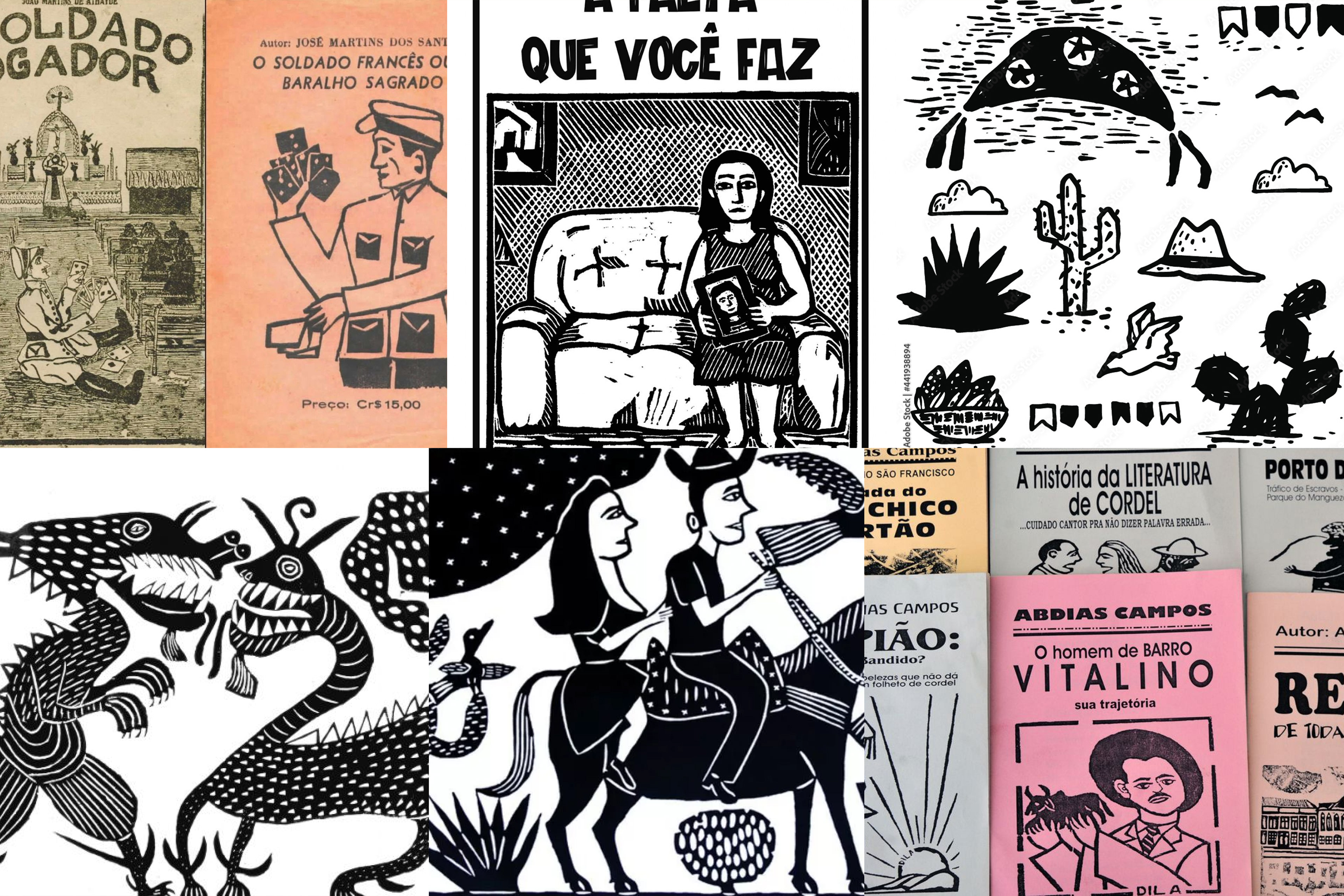
Journeyman's art is inspired by the graphic style used in Brazilian Cordel literature covers, single color tones and hand engravings are the main characteristics of this style.
Journeyman's art is inspired by the graphic style used in Brazilian Cordel literature covers, single color tones and hand engravings are the main characteristics of this style.
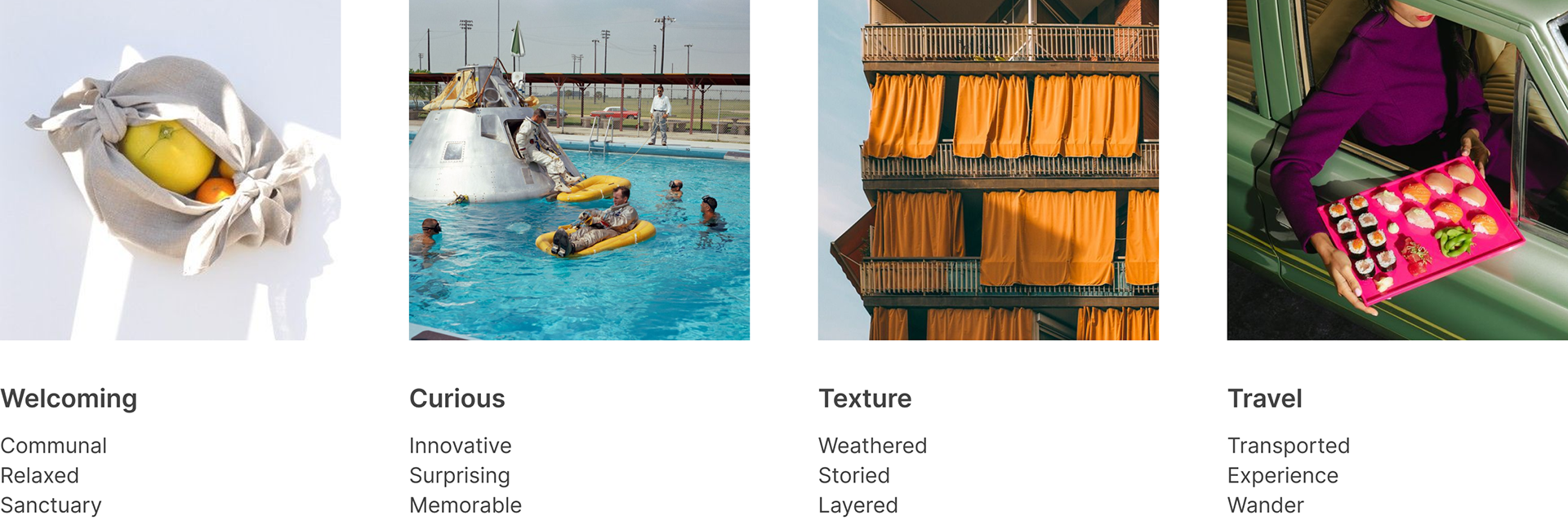
Brand Keywords
Keywords are the character of the brand. They’re a framework upon which the brand expression is built, and they describe the feeling we want the audience to have when they experience the brand.
Keywords are the character of the brand. They’re a framework upon which the brand expression is built, and they describe the feeling we want the audience to have when they experience the brand.
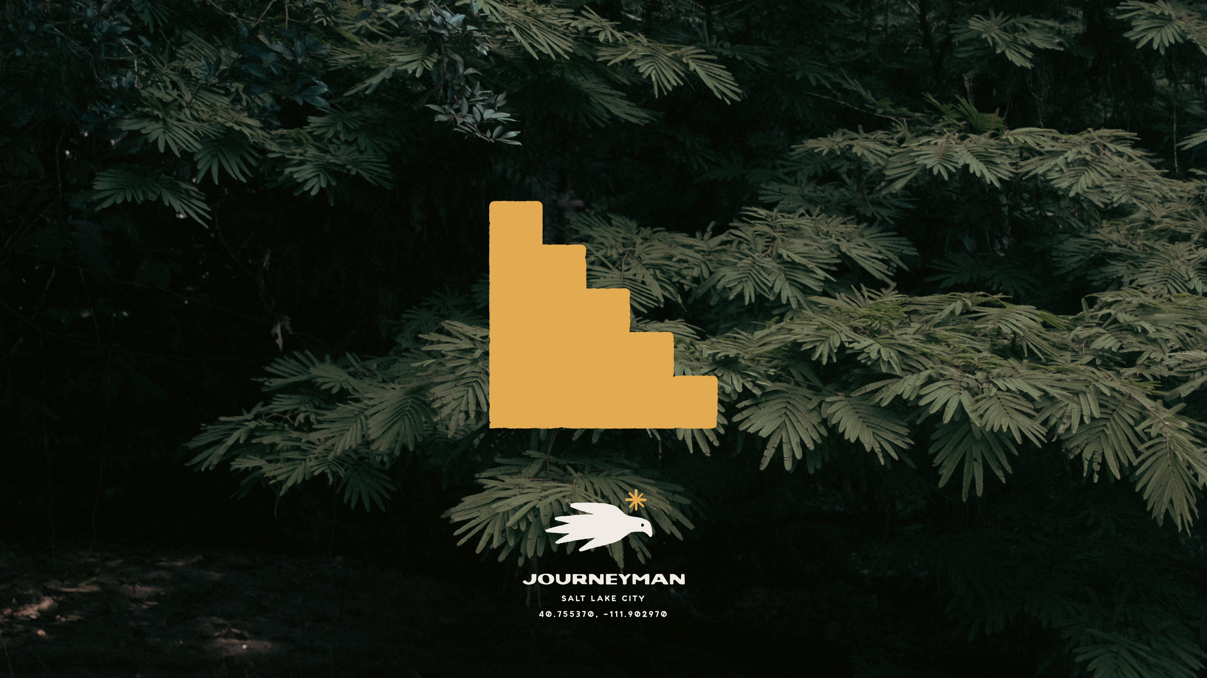
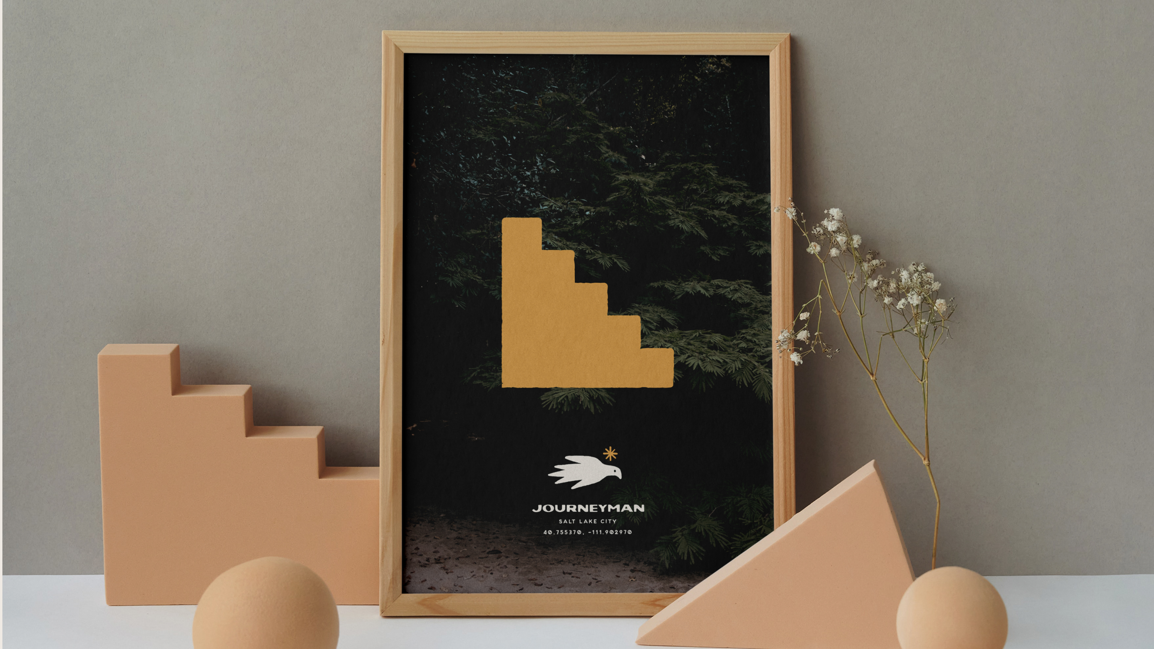
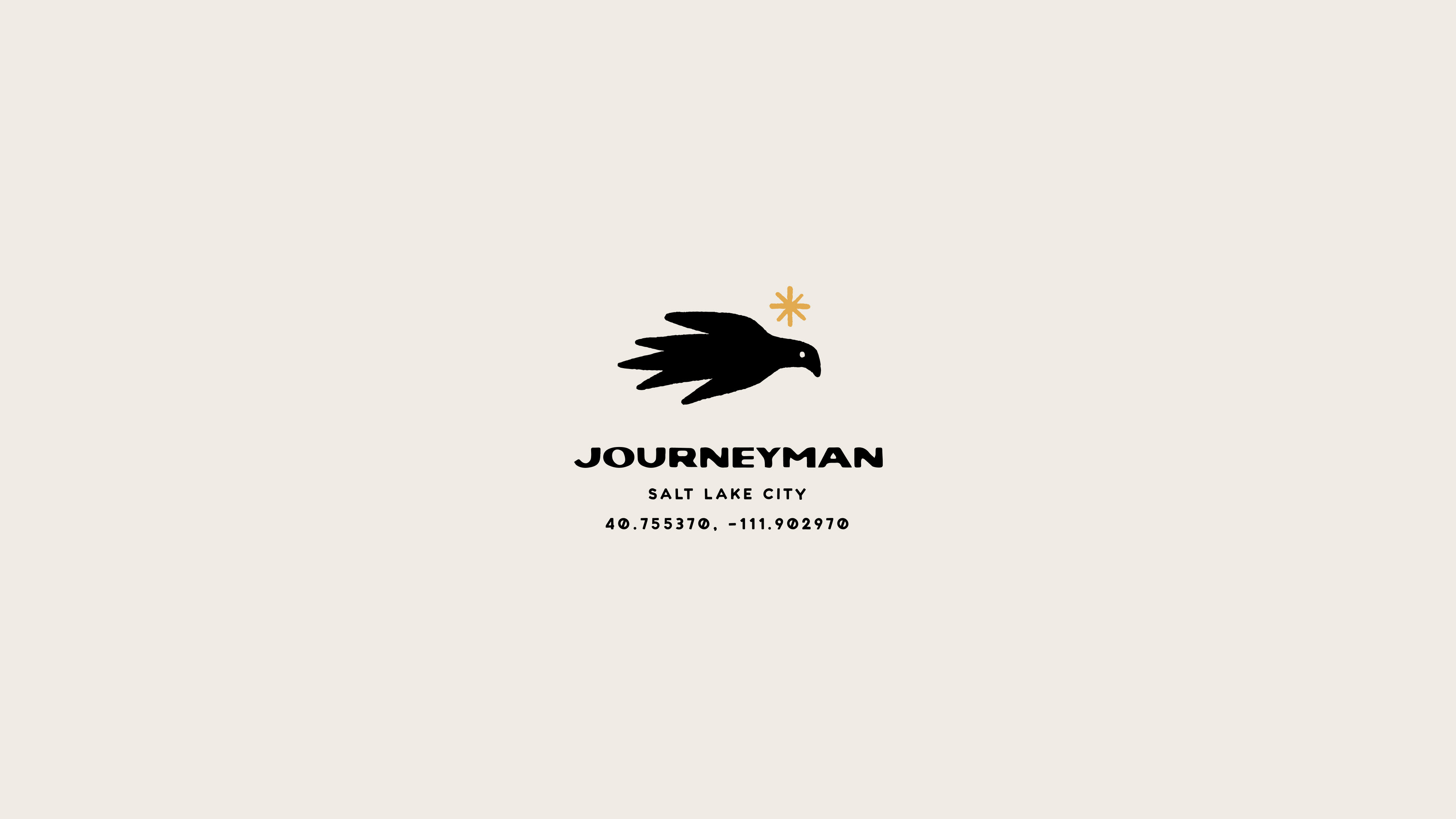
The logo
Inspired by Cordel Literature covers, the Tordo Arrocero Bird representing the Journeyman, and the sun always as its north. The logo may present variations in its format and shape, always maintaining the same Cordel Literature graphic style and its concept with the Journeyman bird.
Inspired by Cordel Literature covers, the Tordo Arrocero Bird representing the Journeyman, and the sun always as its north. The logo may present variations in its format and shape, always maintaining the same Cordel Literature graphic style and its concept with the Journeyman bird.
Typeface
The main typeface of Journeyman is also inspired by the titles of Cordel literature, hand-drawn. In this case, TAY Losa is used for the logo and Birdie as a secondary font for titles. For body text, the Inter font from Google Fonts will be used.
The main typeface of Journeyman is also inspired by the titles of Cordel literature, hand-drawn. In this case, TAY Losa is used for the logo and Birdie as a secondary font for titles. For body text, the Inter font from Google Fonts will be used.
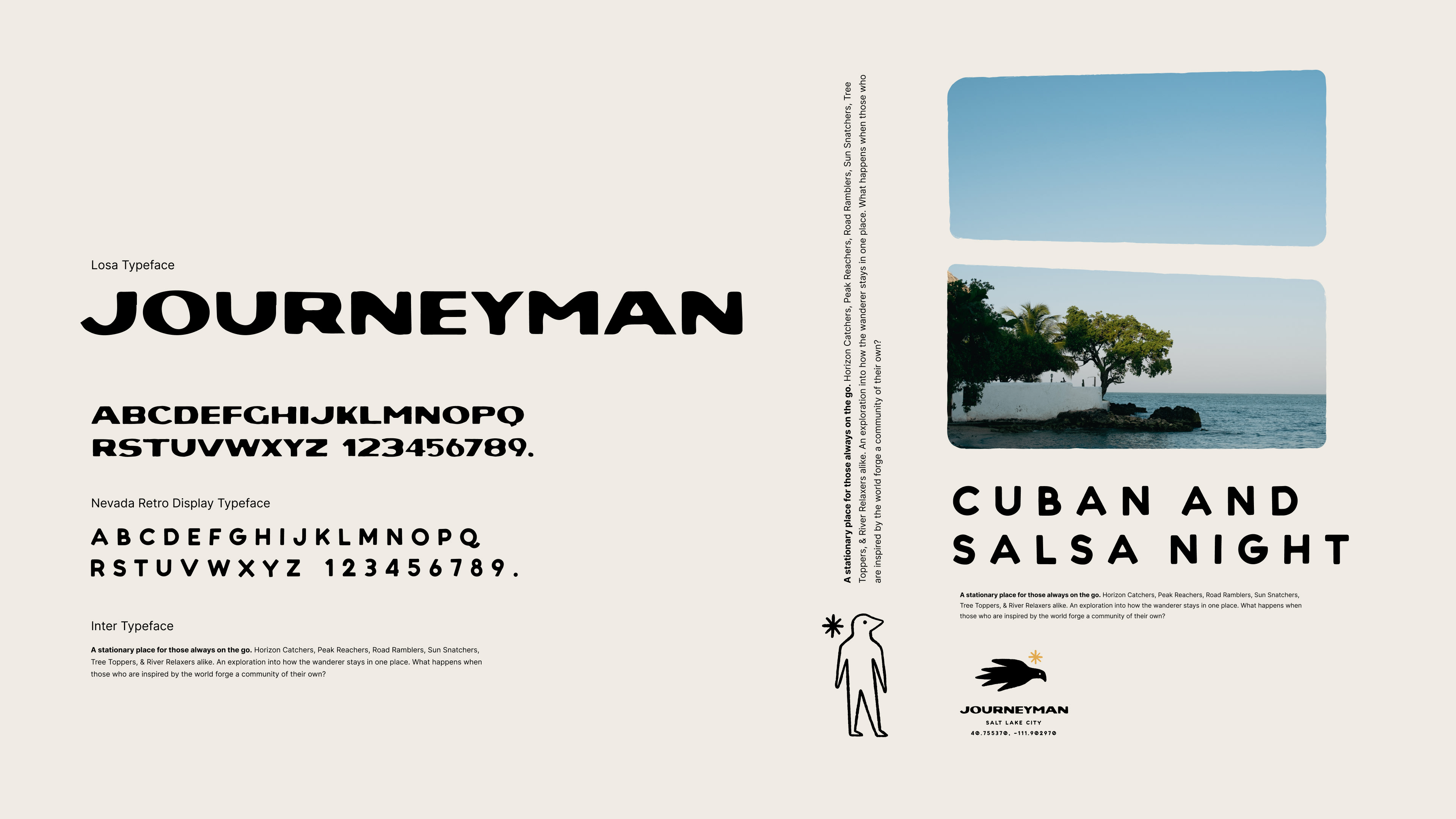
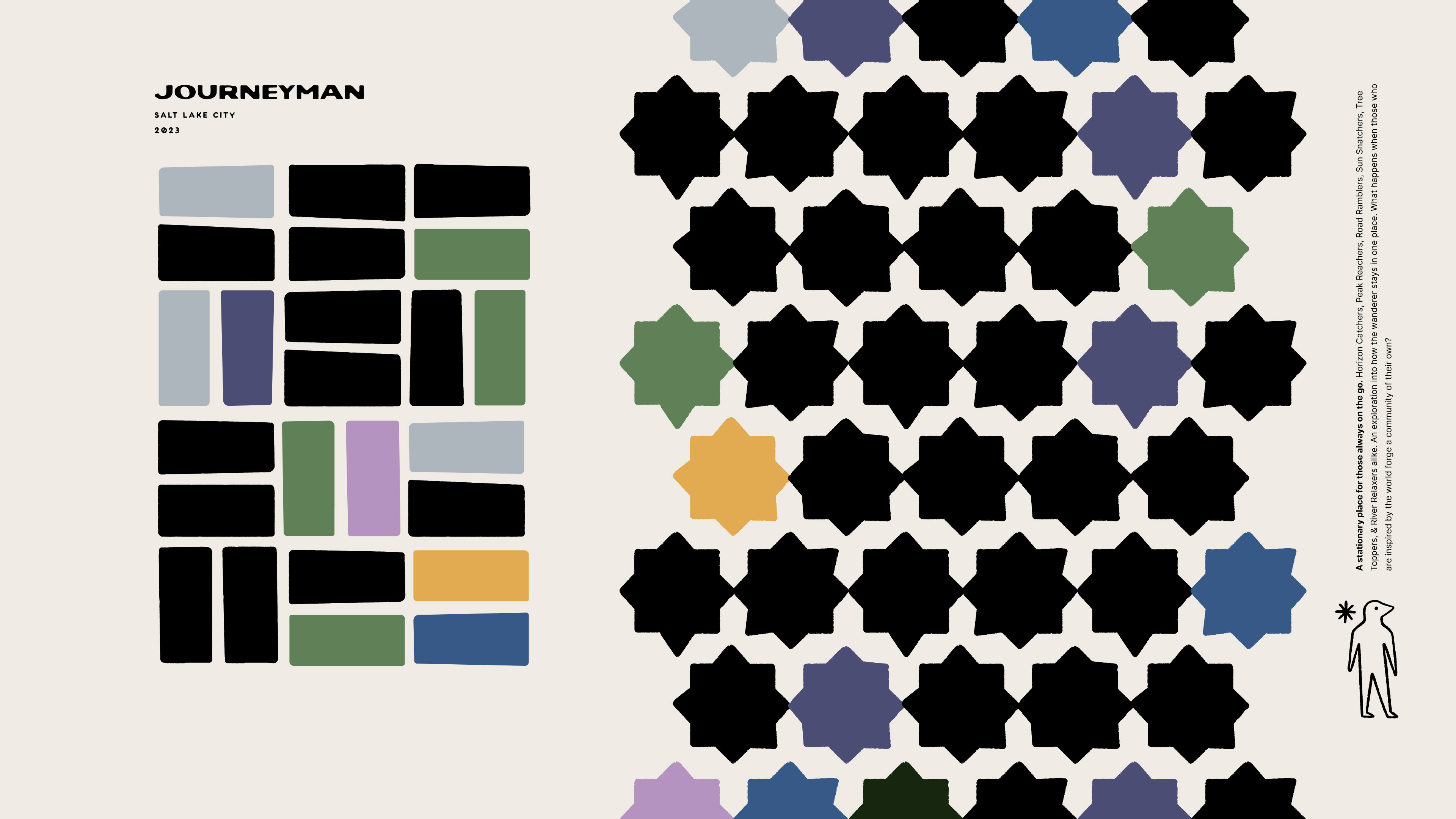
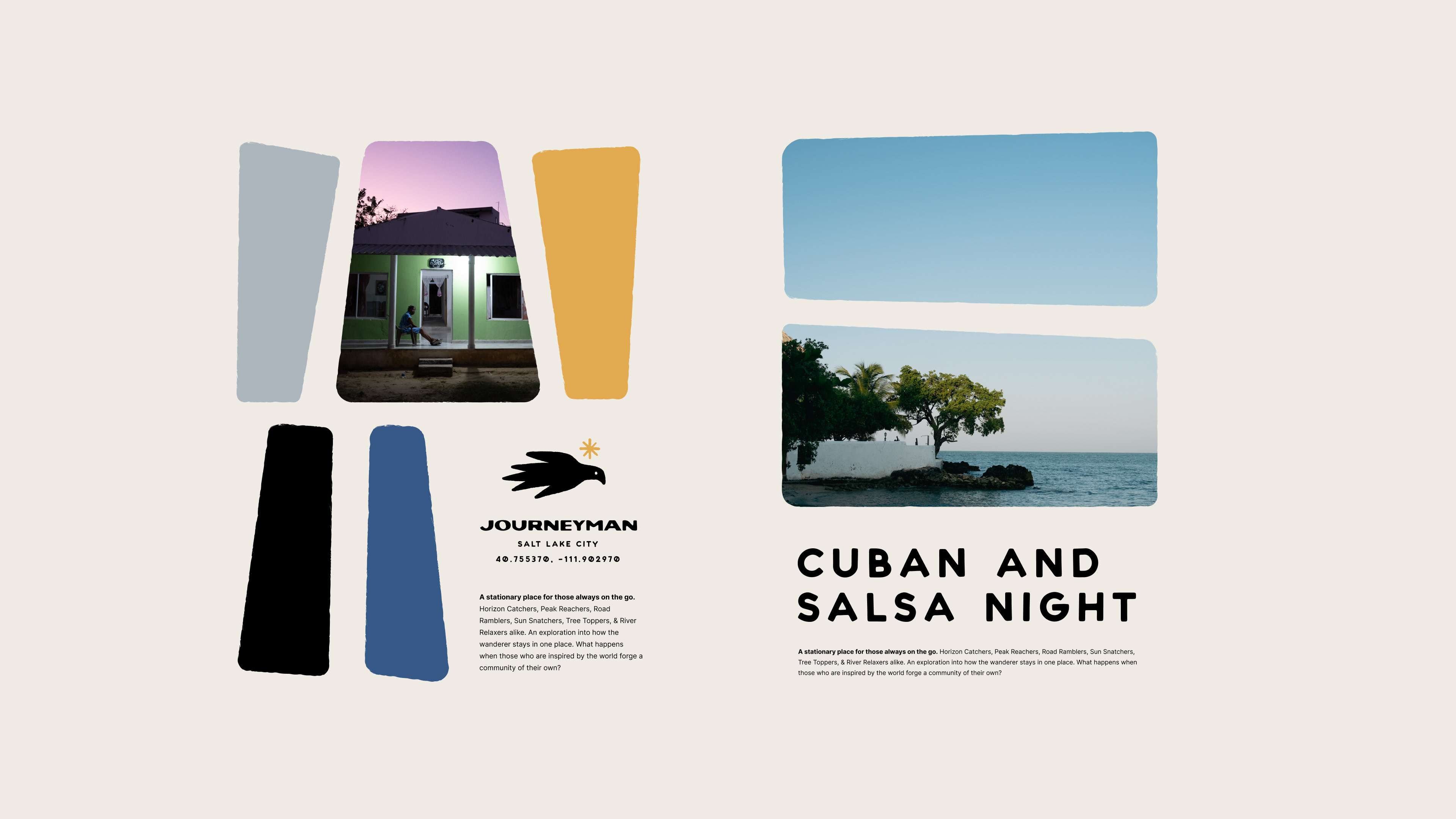
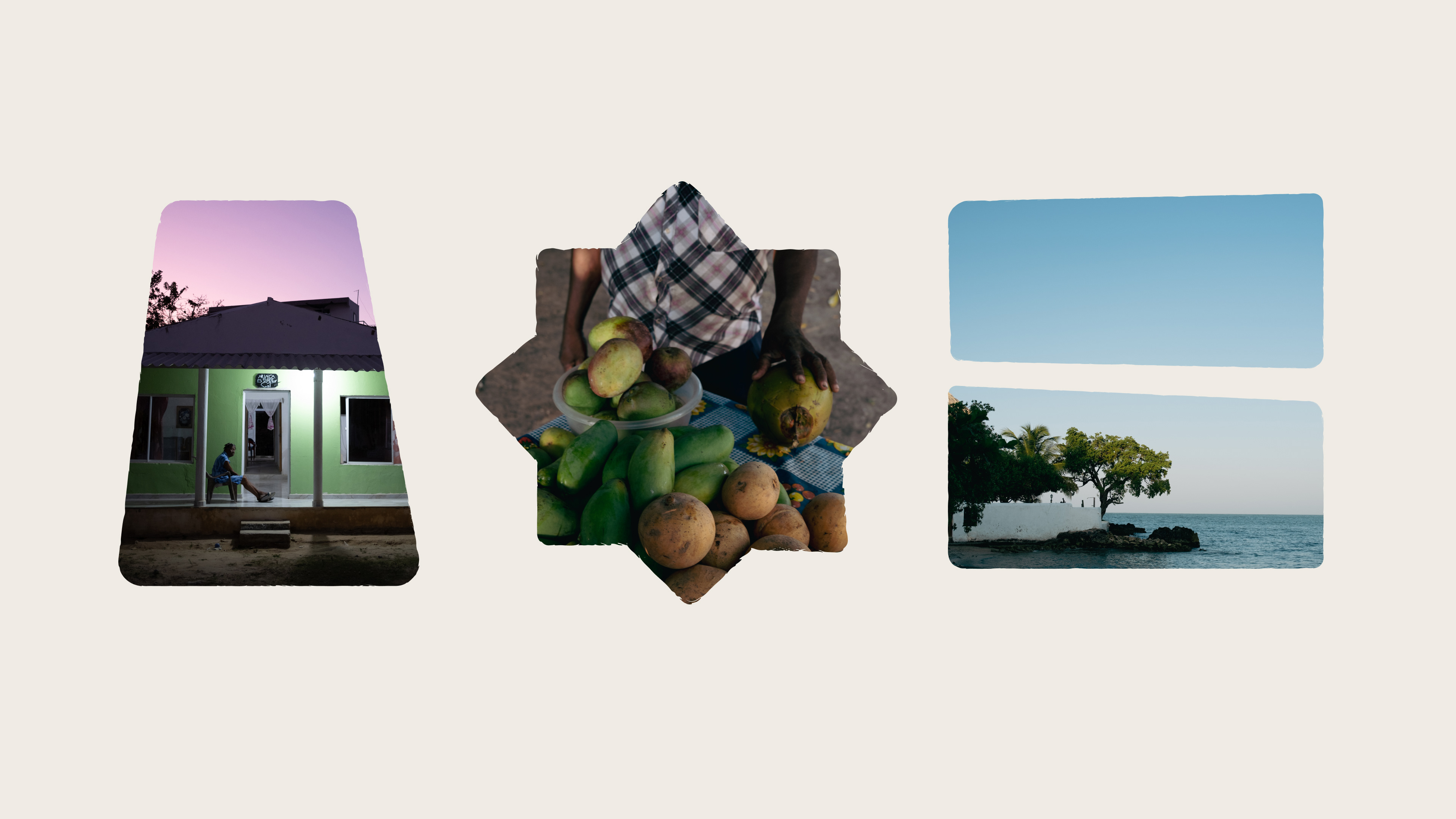
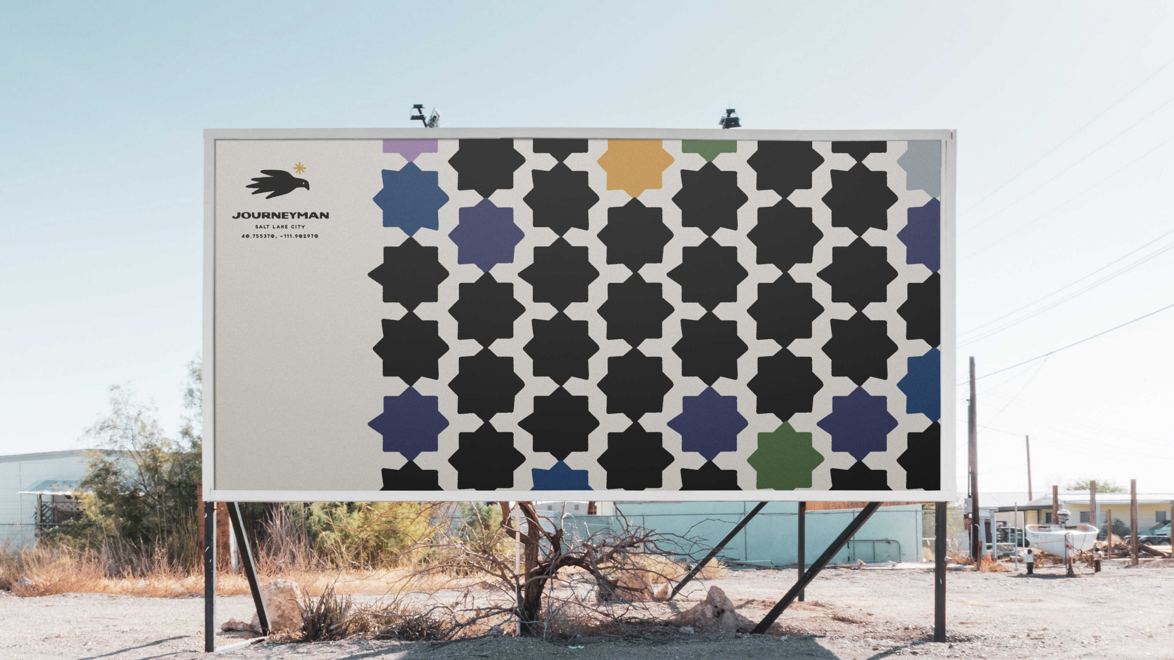
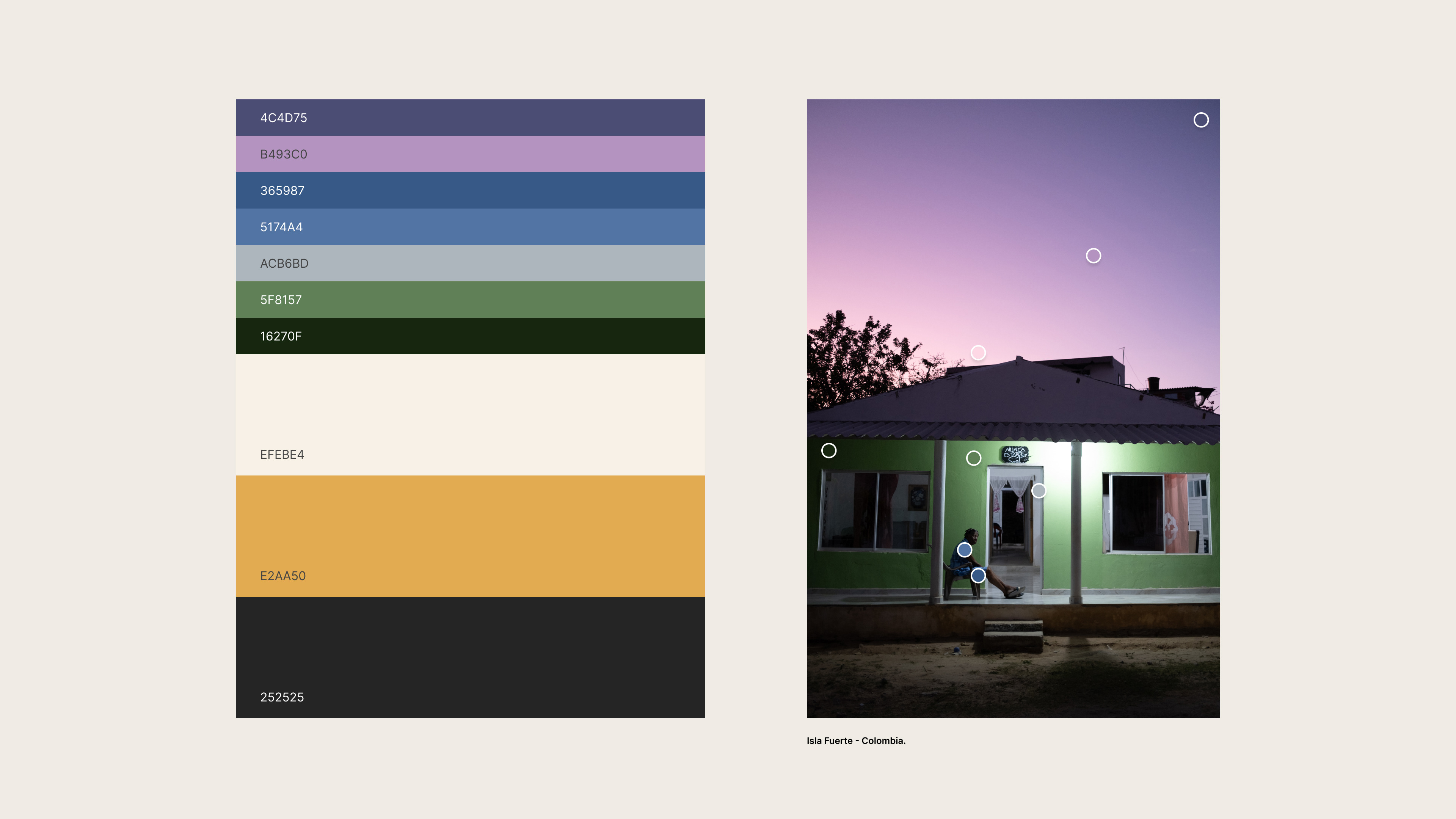
Color Palette
The Journeyman color palette is inspired by a sunset on a Caribbean island called Isla Fuerte, a place on the Journeyman route. Yellow representing the sun and the will to travel.
The Journeyman color palette is inspired by a sunset on a Caribbean island called Isla Fuerte, a place on the Journeyman route. Yellow representing the sun and the will to travel.
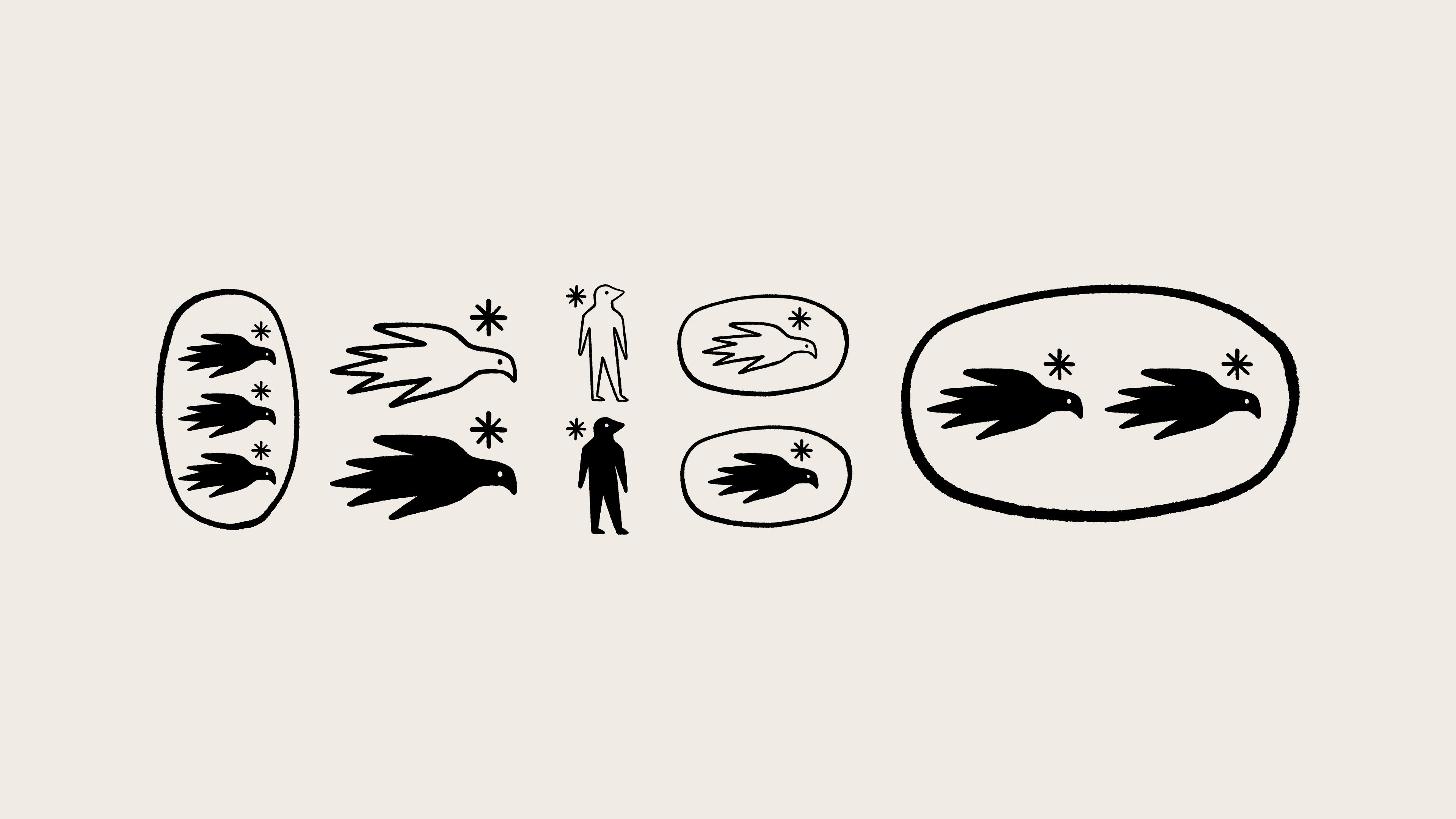
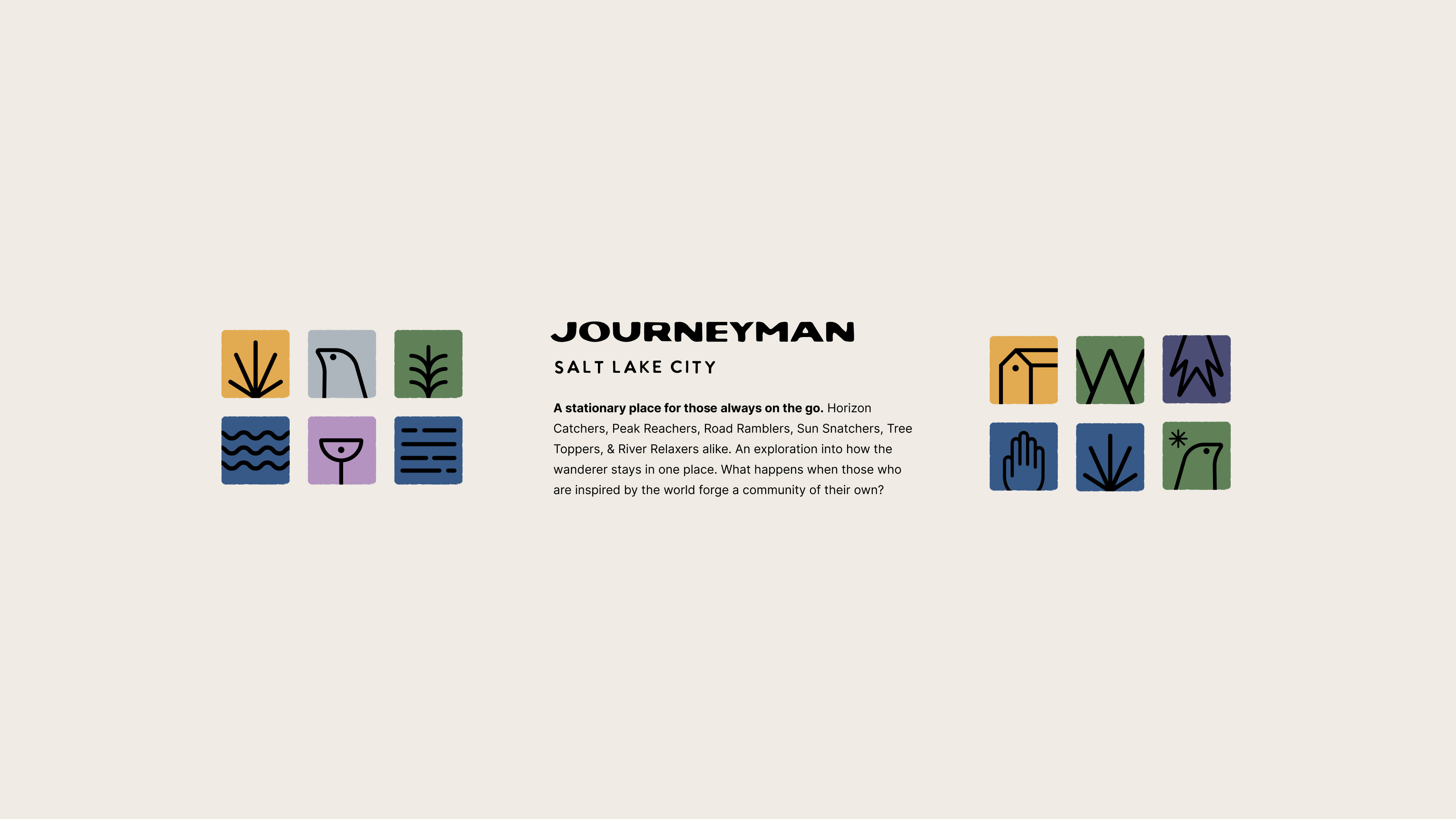
Iconography
Journeyman's iconography will be created to represent different messages, inspired by mosaics and illustrations from Cordel literature. They will be used as graphic support in different graphic pieces.
Journeyman's iconography will be created to represent different messages, inspired by mosaics and illustrations from Cordel literature. They will be used as graphic support in different graphic pieces.
Graphic System